
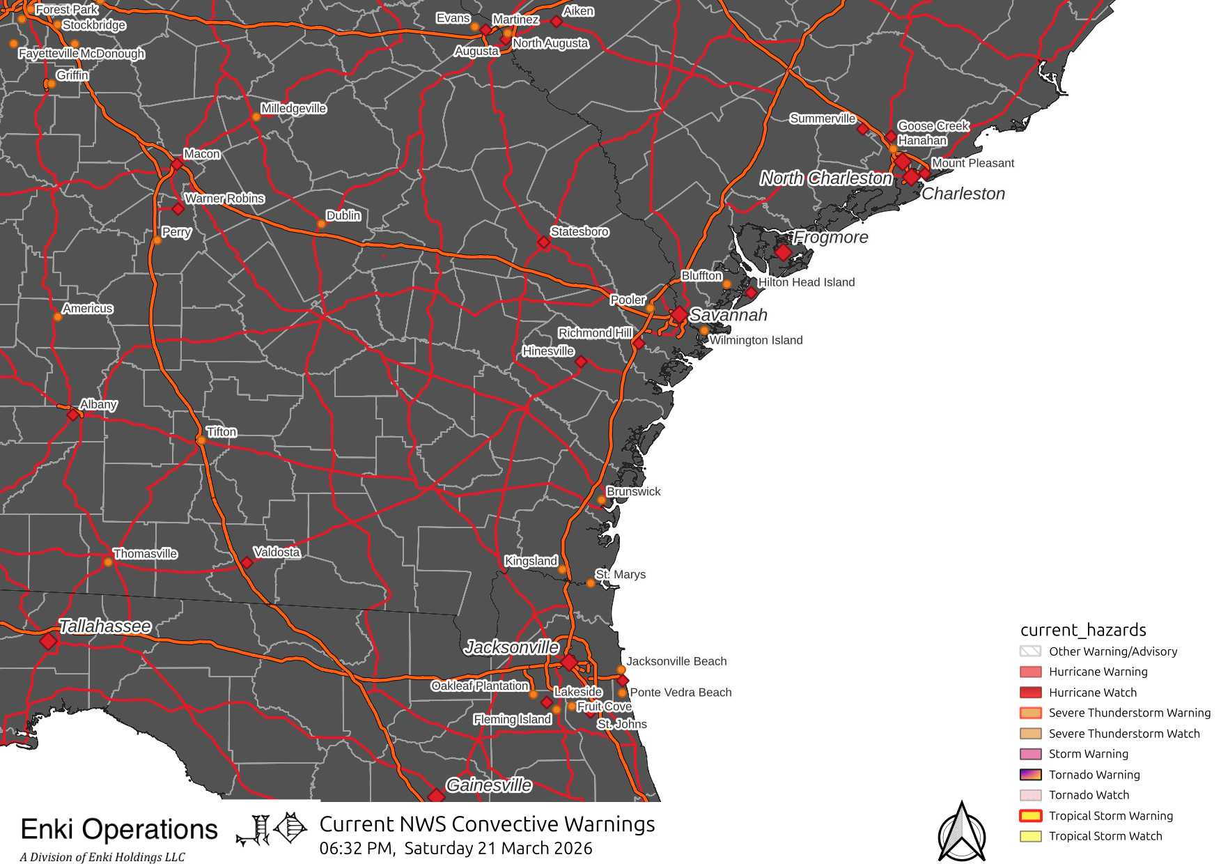
WARNING: Experimental data, do NOT use for decision making! Use data from your local weather service.
A note about time.To ensure consistency around the world, weather data is always in Coordinated Universal Time (abbreviated as UTC as a weird compromise between English and the French Temps Universel Coordonné). The abbreviation itself is usually abbreviated as "Z" for "Zulu" time. That came from the fact that the Greenwich Meridian used by the old time reference system (which is the same as the new reference system), "Greenwich Mean Time", is on the zero longitude line. Here's a link to a longer explaination.
TL;DR? It's actually simple: UTC = GMT = Z. What matters is that the US East Coast (where the maps below are centered) is either 4 hours (Eastern Daylight Time) or 5 hours (Standard Time) behind UTC. All of these maps are time stamped in UTC. This page was generated at
Sat Mar 21 20:35:28 UTC 2026
Sat Mar 21 16:35:28 EDT 2026
Of course, Click any image to embiggen.
| Visual | Enhanced RGBIR | Water Vapor |
|---|---|---|
|
|
|
|
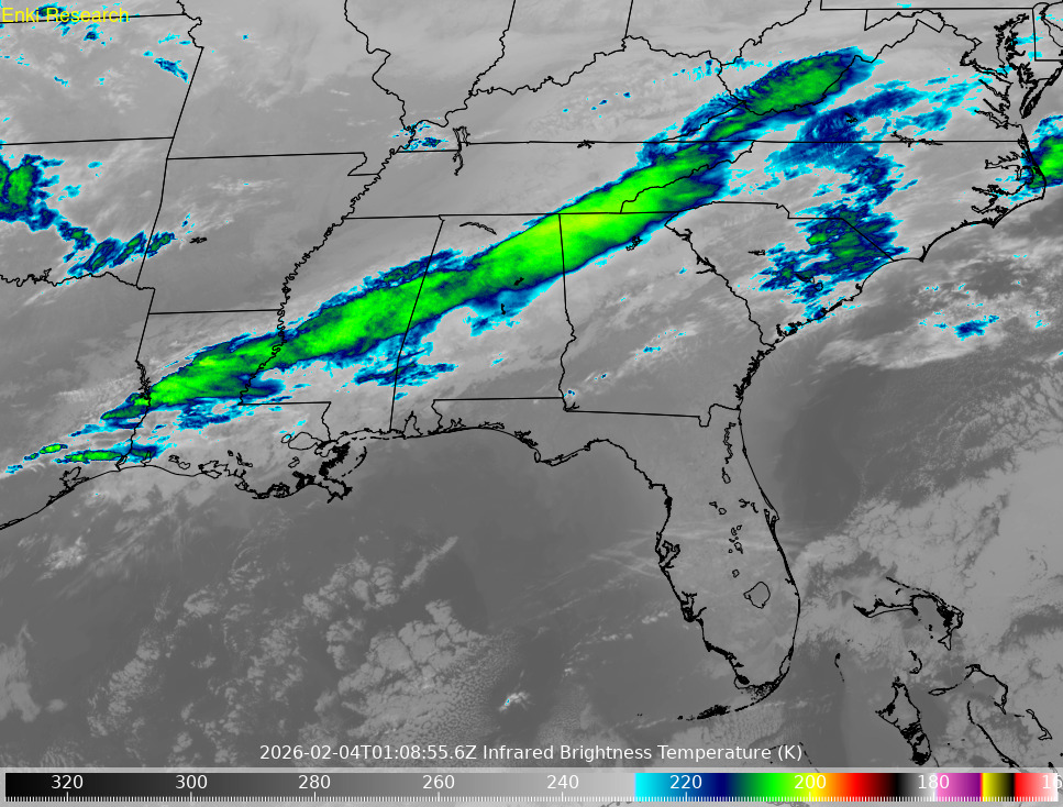
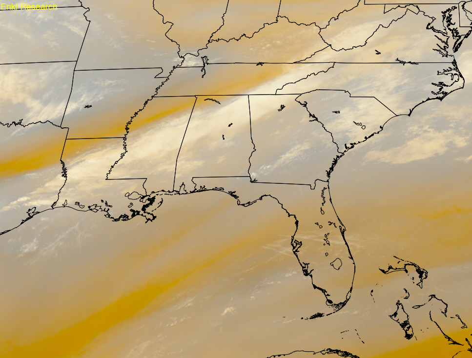
These images are from the GOES-19 (GOES East) satellite. The satellite typically (it is programmable) scans the entire western hemisphere every 10 minutes, and the Contenintal US every 5 minutes. The satellite can scan two subsectors every minute - this is used for severe weather or hurricane monitoring. The satellite also monitors the sun and space weather. The data is received by a 4.5 meter (15ft) satellite dish behind the office and processed by two computers. These images are a subset from the CONUS scans. The left image is a composite of red, green, and blue bands to create a visual color image. It will be black at night. The center image is infrared, with the clouds color coded so higher/colder clouds are various colors since colder cloud tops generally indicate stronger storms. The right image shows water content in the middle part of the atmosphere. Browns are dry, white has more moisture in it.
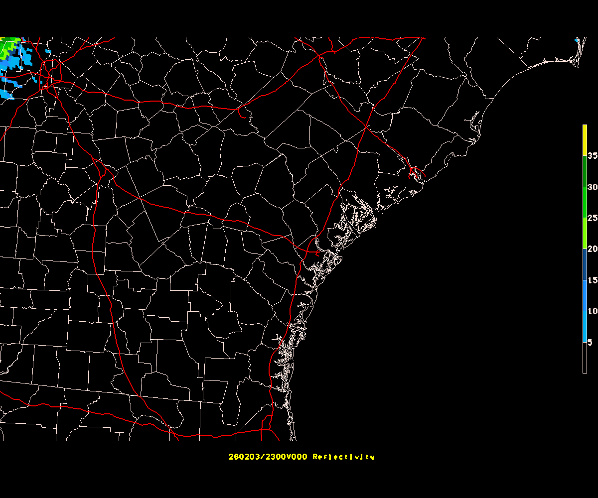
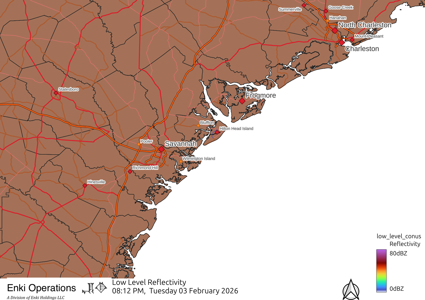
| MRMS Regional Radar | Frogmore Radar Zoom | HRRR Radar Forecast (next 15 hours) |
|---|---|---|
|
 Frogmore Metroplex Radar Animation |
 HRRR Forecast Animation |
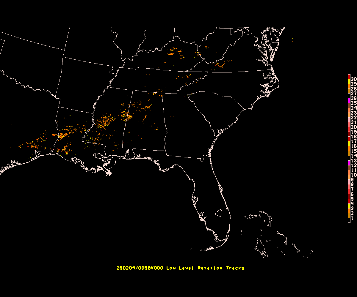
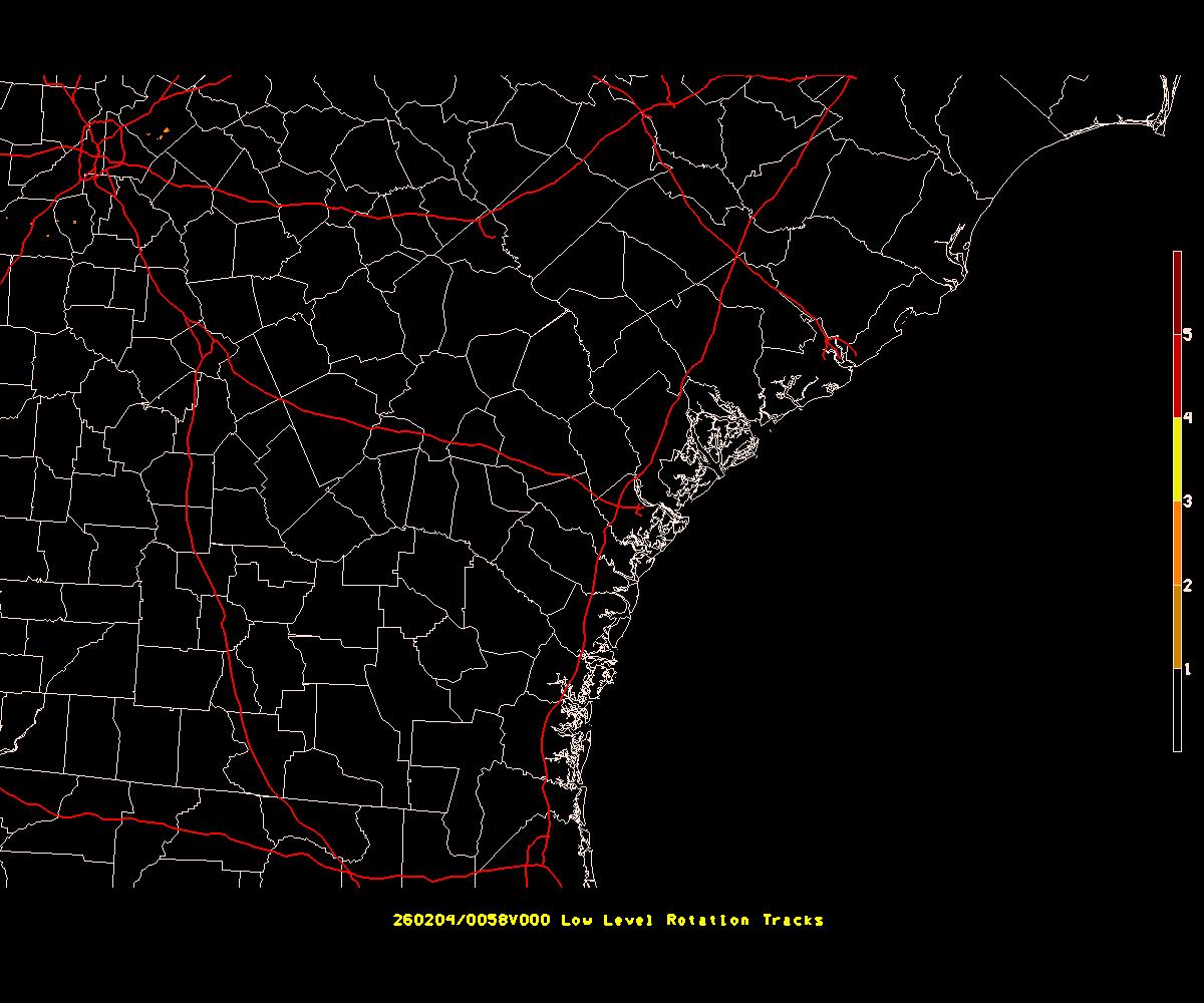
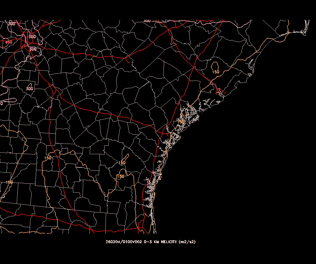
| MRMS Rotation | Frogmore Rotation Zoom | HRRR Helicity Forecast (next 15 hours) |
|
|
 HRRR Helicity Forecast Animation |
|---|
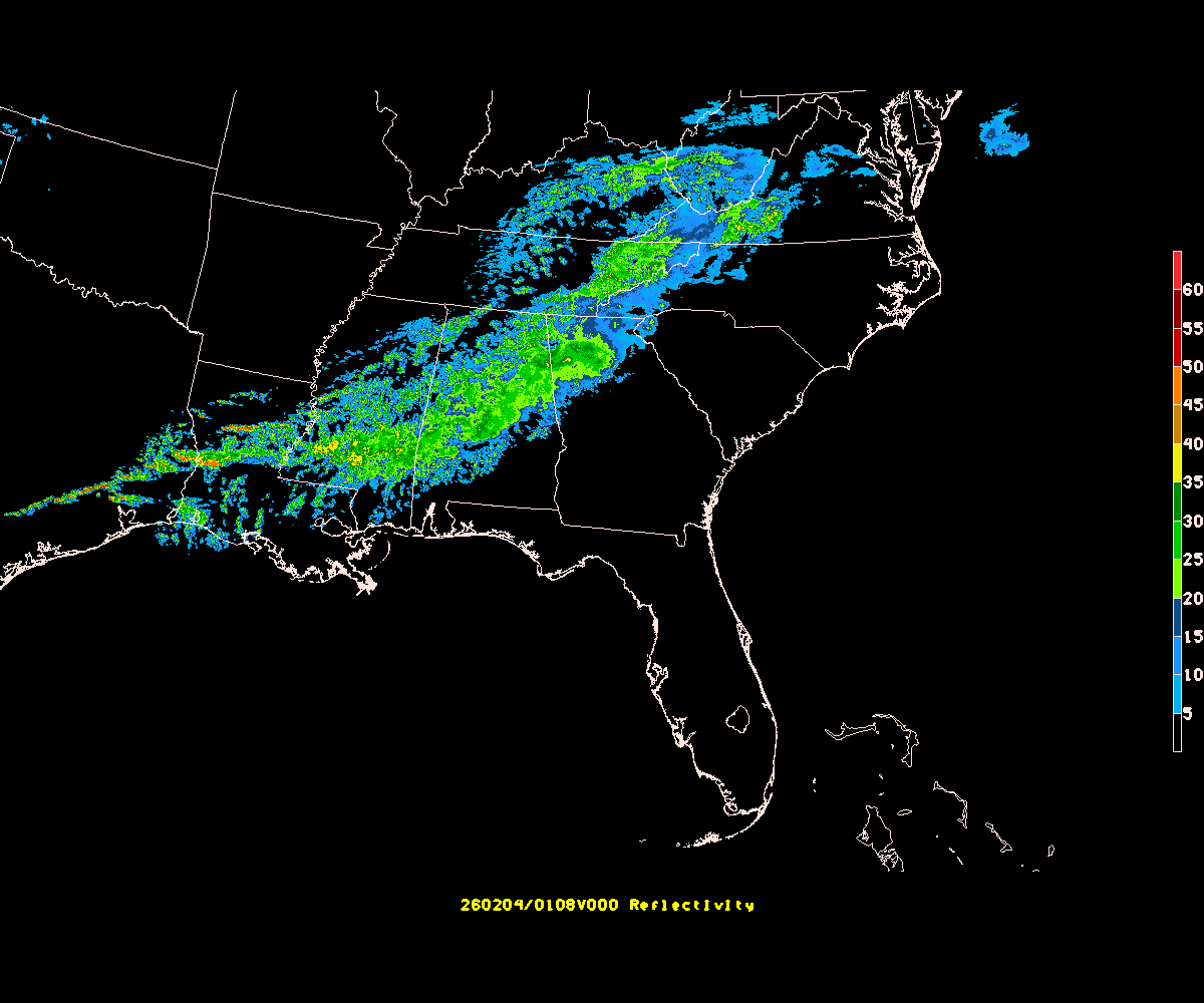
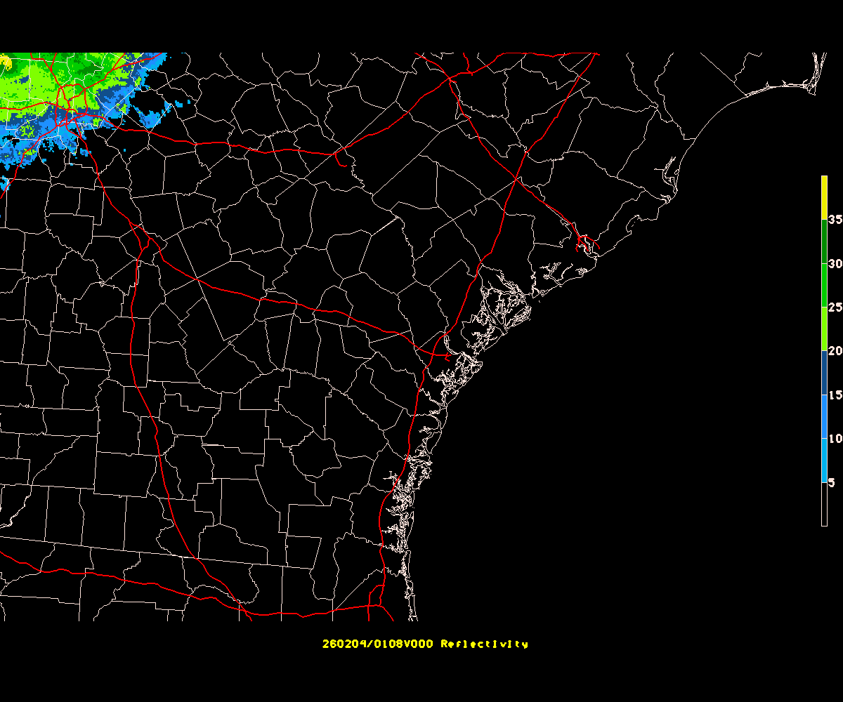
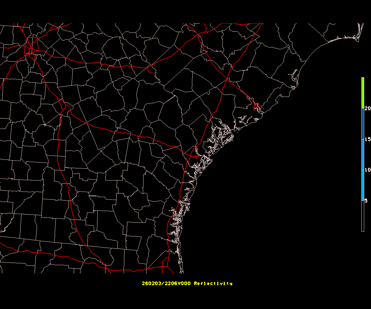
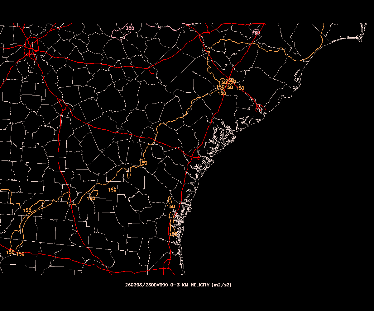
MRMS is the Multi Radar Multi Sensor system that integrates data from the national NEXRAD radar network as well as surface observations to provide a uniform data layer. Here two data outputs are used, the low level radar reflectivity, and the low level rotation (maximum shear over a 30 minute interval), which is an indication of tornado potential and once they develop, tracks. MRMS data updates every 10 minutes.
HRRR is a model that is run every hour, out to 18 hours most of the time but out to 84 hours four times a day (at 0, 6, 12, and 18Z). The first variable shown here is the simulated radar for the next 18 hours. Because of the time it takes to assimilate data and run the model, the first couple of hours of each run are already in the past! So by comparing the third hour with the observed radar, we have an idea of how good (or bad!) the model run might me. Helicity is the amount of corkscrew-like motion in the air, and is measured in meters squared per seconds squared (m2/s-2). This is a good indication of severe weather potential. Values over 150 are worrisome, over 300 indicate severe thunderstorms with possible tornadoes are likely. HRRR graphics update every hour at about 48 after.
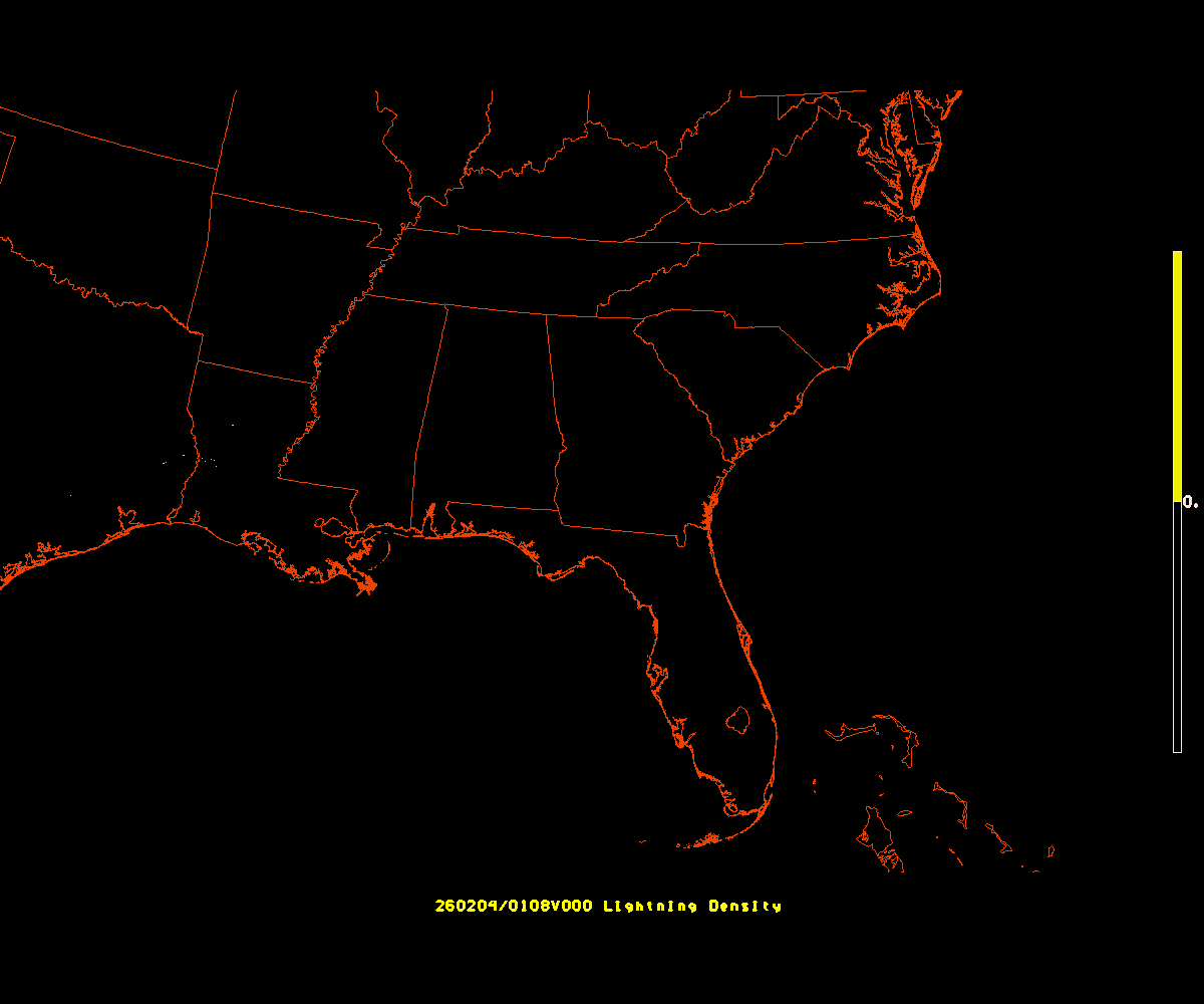
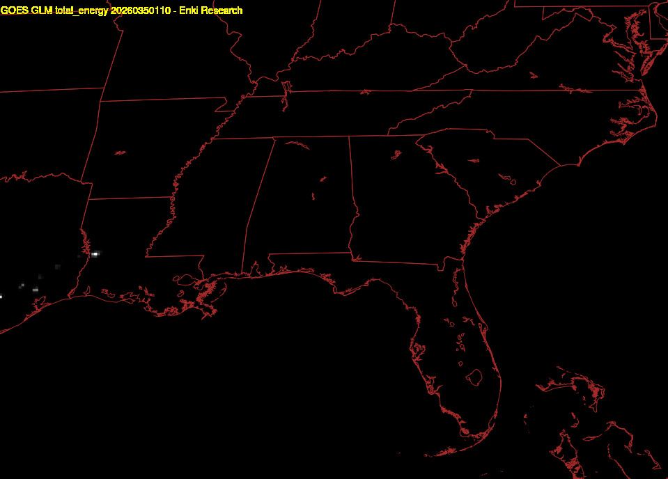
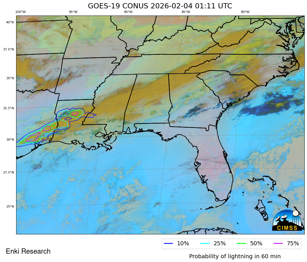
| Ground Strikes (last 15min) | Lightning Flashes (last hour) | Lightning Forecast (next hour) |
|---|---|---|
|
 Flash Animation |
|
The lightning analysis first shows the ground strikes over the last 15 minutes from the National Lightning Detection Network and processed by the MRMS system. The second map shows lightning flashes seen from GOES East. The static map is the last 5 minutes, below the map is a hyperlink you can click to show an animation of the last hour. The third map is the probability of lightning in the next hour. This analysis is run locally using data from our GOES ground station data and an algoritm from the University of Wisconsin-Madison Space Science and Engineering Center LightningCast package.
| MRMS LLREF | Precip Type | 24 hour precip total | three day precip total |
|---|---|---|---|
|

|
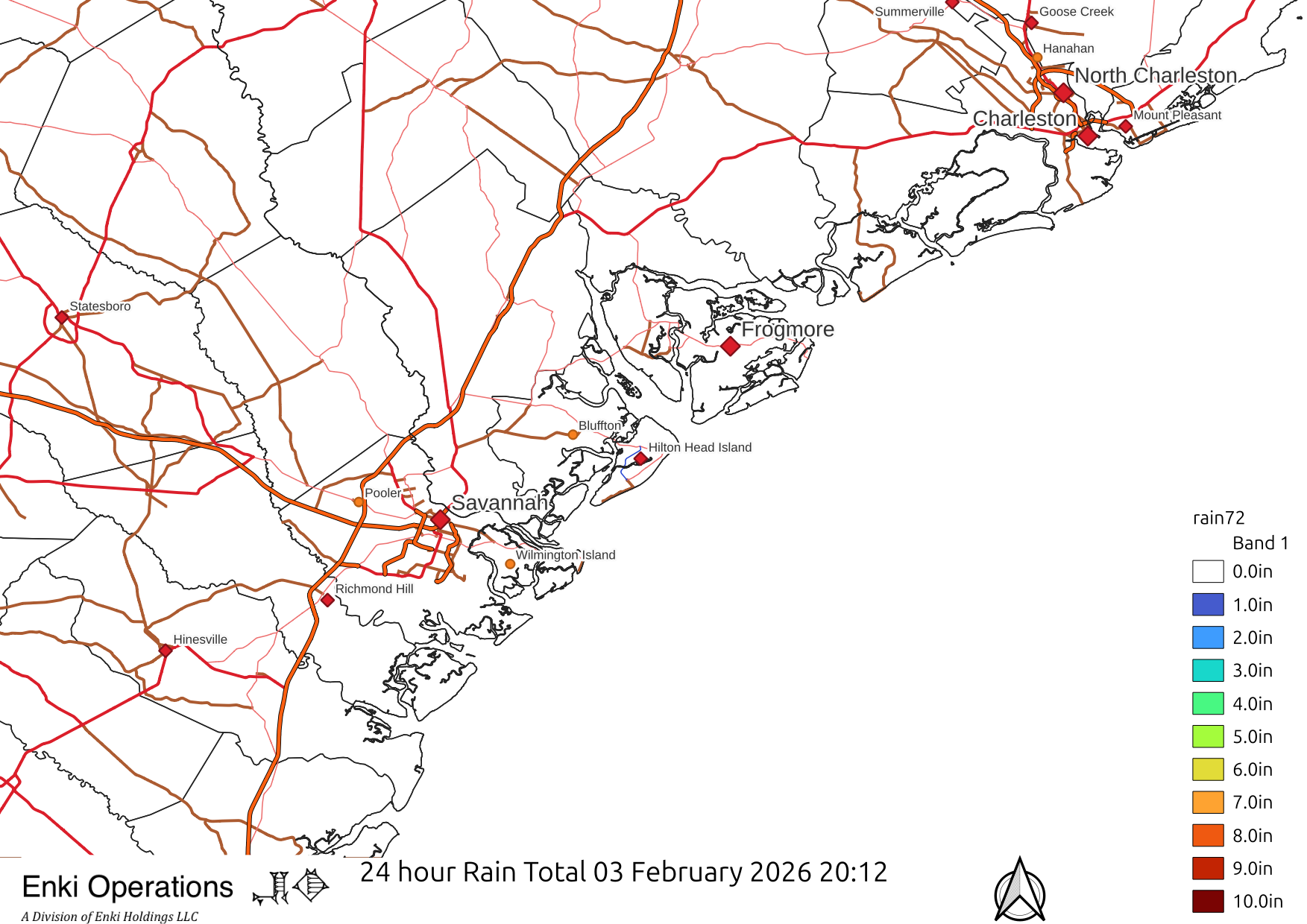
|
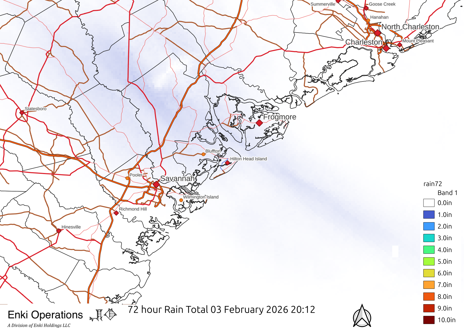
|
These maps are from the same sources as above GEMPAK maps (MRMS, etc) but created using the QGIS mapping package to make fancier maps.
| Southeast | Frogmore Metroplex | Frogmore Severe Only |
|---|---|---|
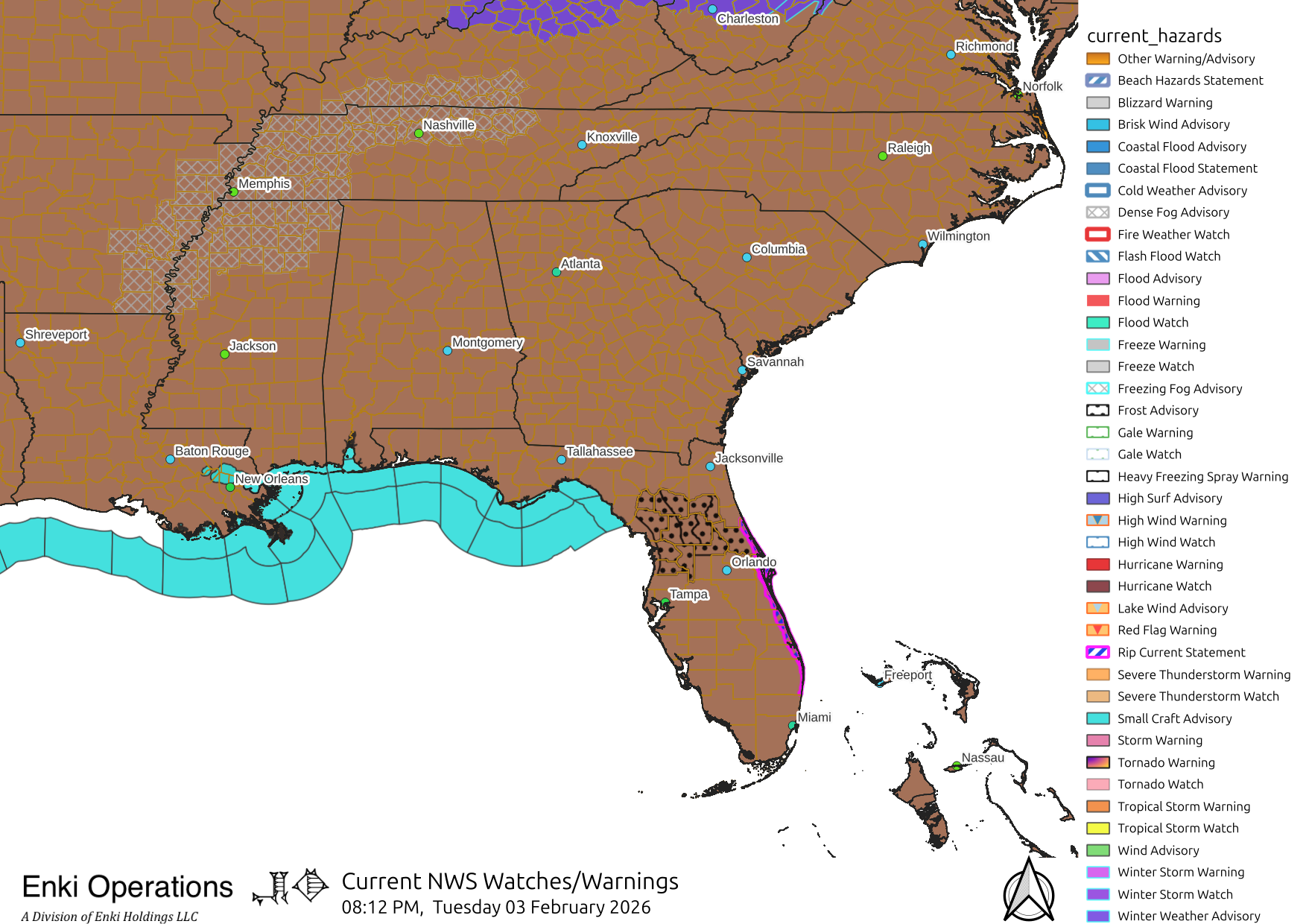
|
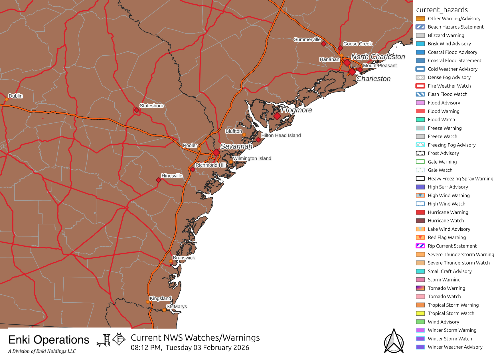
|
|
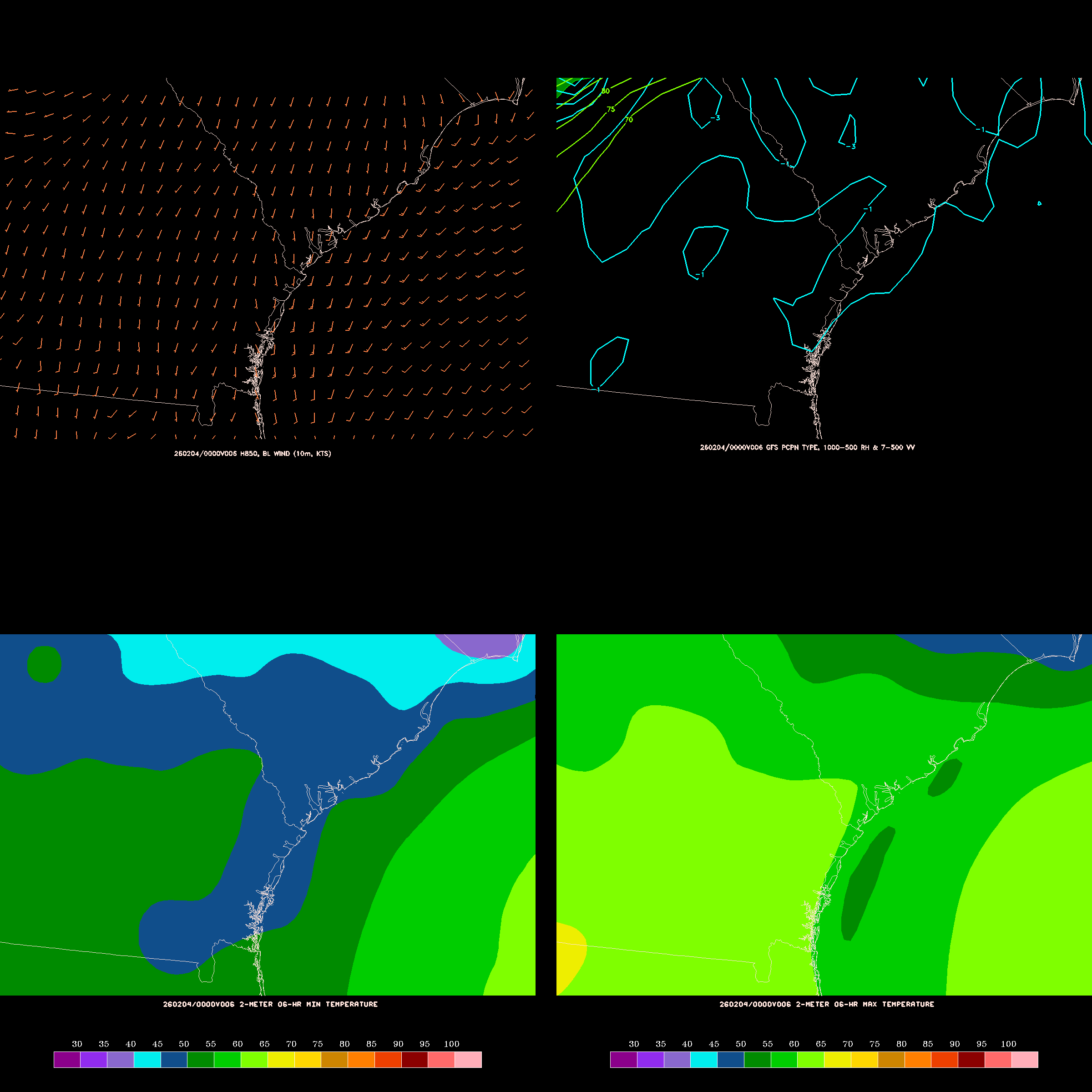
These graphics are generated from the US Global Forecast System (GFS) run and are updated four times a day shortly after each GFS run is finished. This set of snapshot graphics shows the ouputs at six hour intervals for the next six days. Each graphic (called four-panel maps) has four panels or variables. The upper left is wind speed and direction. The upper right is precipitation type and vertical velocity. The lower left is minimum temperature over the preceeding six hours, the lower right is the maximum temperature over the same period.
Click the image to start the gallery, clicking each image steps forward six hours (to go back there is a navigation control at the bottom).
The times on the graphics are valid times in UTC, so if the map says something like "251218/0000V114",
that means the data is for forecast hour 114, which is December 18th at 00 (midnight) UTC. Since Frogmore is five hours behind UTC in winter (4 in summer), that means 00Z
is 7pm EDT the previous day (the 17th).